
2027 Paint Colors of the Year: Four Colors Worth Seeing
Thinking about a new interior color for your home? Several major paint companies have already announced their 2027 Colors of the Year — from soft green and earthy olive to smoky blue and a warmer neutral.
Updated:
A color that looks great on a small swatch can look very different once it covers an entire wall or room. Natural light, flooring, trim, furniture and surrounding colors all matter.
On-screen approximation
Actual paint color may vary.
Sherwin-Williams
Celery
SW 6421
What it is
An airy herbal green with subtle yellow undertones. Quieter than a bright lime, warmer than a cool mint.
Where it could work
Bedrooms, home offices, or living rooms where you want calm color without going fully neutral. Also a candidate for a powder room or dining area if trim and flooring can carry a green undertone.
Before you commit
Check it in morning and afternoon light. North light can push greens cooler; warmer light brings out the yellow. Hold it next to flooring and trim before committing four walls.
Official Sherwin-Williams pageOn-screen approximation
Actual paint color may vary.
BEHR
Grounded
T27-01
What it is
An earthy moss/olive green with brown undertones. Deeper and more settled than a soft pastel green.
Where it could work
Living rooms, dining rooms, studies, or built-ins where you want a quieter, settled wall. Can work as an accent wall if the rest of the room stays lighter and the flooring can handle the depth.
Before you commit
Appearance can shift with light and surrounding finishes. In a dim room it can read heavier; next to warm wood it may feel browner. Sample more than one wall, morning and evening.
Official BEHR pageOn-screen approximation
Actual paint color may vary.
Pittsburgh Paints / PPG
Artifact
PPG10-16
What it is
A smoky, deeper blue with more weight than a pale sky blue. Reads as a blue with depth, not a bright primary.
Where it could work
Bedrooms, offices, dining rooms, or built-ins where you want calm without going gray. Works best when trim stays crisp and flooring does not fight the undertone.
Before you commit
Deeper blues change under warm bulbs versus daylight. Check next to flooring, stone or tile, and the trim sheen you plan to keep. Walk into adjoining rooms so the transition does not feel abrupt.
Official Pittsburgh Paints / PPG pageOn-screen approximation
Actual paint color may vary.
Valspar
Cottage Door
8004-38E
What it is
A mid-tone, grayed-out blue with warm and cool undertones. More of a reflective neutral blue than a bright coastal blue.
Where it could work
Living rooms, bedrooms, hallways, or dining spaces where you want color without a strong statement. Can sit next to warmer wood floors if the undertones are checked carefully.
Before you commit
Grayed blues can lean cooler or warmer depending on light and neighboring finishes. Look at it beside trim, flooring, and any stone or tile. Use a real sample in the room — not only a phone screen.
Official Valspar pageBefore You Choose a Color for the Whole Room
Manufacturer announcements are a starting point. Before you paint an entire room, put the color in the actual space. For a fuller walkthrough of light, flooring, trim and adjoining rooms, see how to choose an interior paint color.
- Look at the color in the actual room
- Check it during daylight
- Check it after the lights are on
- Look at it next to flooring
- Look at it next to trim
- Consider permanent finishes such as stone or tile
- Consider the adjoining room
- Use an actual paint sample before committing to the whole room
When a Color Change Affects the Painting Work
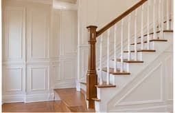
A big move from a dark wall to a light color — or the other way around — can change the painting work. Depending on the existing color and the new one, you may need primer, extra coverage, or more than one finish coat. Repairs can also show more clearly under a different shade.
Wall color also relates to trim, ceilings and doors. If those surfaces stay the same while the walls change, look at the combination before the room is fully painted. Not every color change needs the same prep or the same number of coats — ask what is included in the estimate.
More on interior painting preparation and comparing painting estimates.
Color of the Year Is Inspiration, Not a Rule
Manufacturer Colors of the Year are useful for discovering colors. You do not need to choose one simply because it is current. The better choice still has to work with the room, the light, the floors, the trim, the permanent finishes and what you want to live with.
If trim, ceilings or doors are part of the project, those surfaces should be named in the estimate. See interior trim painting and ceiling painting.
More 2027 Colors of the Year are still being announced. Additional major manufacturers will be added as their selections are released.
Thinking About a New Interior Color?
If you're considering a new wall color or a larger interior painting project, call to discuss the rooms and surfaces you want painted.
Or request an estimate. For what usually changes the number, see interior painting cost.